
Did you know that more than 85% of the product purchase decisions are based on color? Color psychology plays a pivotal role in web design. It might sound a bit weird, but the fact is, as human beings, we are visually driven towards colors. Visual stimuli work as a guide in everything we do.
This is exactly why color schemes are important to consider in web development and design. Consider the biggest brands in the world. Every single one of them has distinct color schemes that associate with their brand identity, for instance, McDonald’s, it’s red and yellow.
How to choose the best color schemes for a website?
Here are some quick tips on choosing the right colors for your website.
1. You need to understand how color affects our emotions. Familiarize yourself with how color affects us. Yes, the impact of color indeed varies on a certain geographical location. The colors that appeal to the American Shoppers may not appeal to the Indian shoppers in the same way.
Here is a pictorial breakdown of how different CTA buttons affect shoppers in North America.

2. Next is to consider the overall demographic. Who is your target audience? What kind of emotions are you trying to generate? Research on the personality and emotions of your target audience. Then choose the right color that will be the primary color or base color during web design.
For instance, if you are an organic food development company, the best option is to keep green as the primary color. Since green is associated with health and nature.
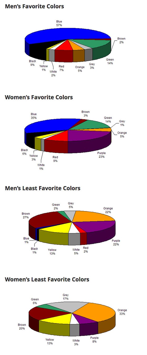
3. You can consider gender as well. This may not work for all companies, but if you are an e-commerce organization, try to know what are men’s and women’s favorite color. Also, what colors do both the genders don’t like?

Image Source
As you see, men like blue, green and black to some extent and they dislike purple and brown. Women like purple and blue and dislike orange and purple.
4. Decide on how many colors you are going to use. If you have a primary color in mind during web design and web development. Now, figure out how many other colors you want to use. You won’t find a one-size-fits-all formula, but you can try the 60-30-10 rule.
It is simple. 60% of the dominant color, 30% of the secondary color, and 10% of the accent color. Ideally, you should use three colors, but that doesn’t mean you cannot try for more. Try not to use more than four though.
5. Choose a contrasting set of colors. Determine the set of colors that you want to use. Preferably a bright colored background along with a darker foreground is a good option. It makes things easy on the visitors’ eyes and creates an aesthetic appeal.
However, some websites easily pull off a darker background as well. Make sure you opt for visually appealing web design.
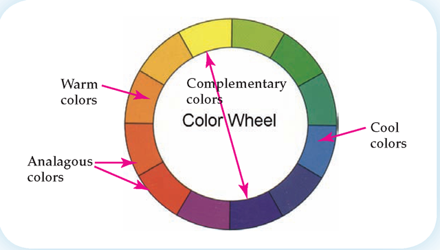
6. Consider the color wheel. The color wheel can be of immense help. What you can do is choose the “analogous colors” that are almost identical. Or you can also opt for the “complementary colors”. The complementary colors are directly opposite each other.

Image Source
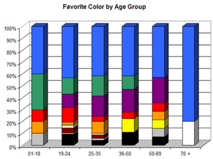
7. Consider the age group as well. Did you know that the color preference of an individual change with age? Here is how the color preference changes with age.


Why color schemes are important in digital marketing?
When we think about digital marketing and social media marketing, certain things pop up into our heads. Most of us think about statuses, engagement, profile pages, images, and more. If you don’t consider the small details in colors, you are missing out on a significant chance to be truly successful.
Contrasts in colors draw eyes to certain elements and that makes them stand out. Use it to your advantage while publishing content for web and mobile marketing. Make sure that there is consistency in the color of the contents you share.
Know that your brand will be perceived in the way it looks. Thus, it is imperative to have consistency in your brand color. A well-integrated color scheme immediately connects with your target audience. Make sure to share content in your social media profiles with a consistent color scheme.
This is a purposeful way of drawing immediate connection. Branding is a significant aspect of digital marketing and social media marketing. A signature color can increase brand recognition by 80%. For instance, we associate Facebook with blue.
A lot of buyers also believe that the color reveals the true nature of the products and services. Thus, 30% of the world’s top brands use blue in the logo. Blue is associated with credibility and trustworthiness. These are the two factors that most of the customers want.
A lot of companies also use different names with the same color to increase sales. For instance, if you want to sell “green” purses online, the chances of selling more pieces will increases if you call them ‘emerald’. While preparing the products for branding, some of the marketers explore this strategy to generate interest among consumers.
Have you tried color psychology in web design? What are your thoughts? Share with us here.
For more interesting content, visit our blogs here.


